
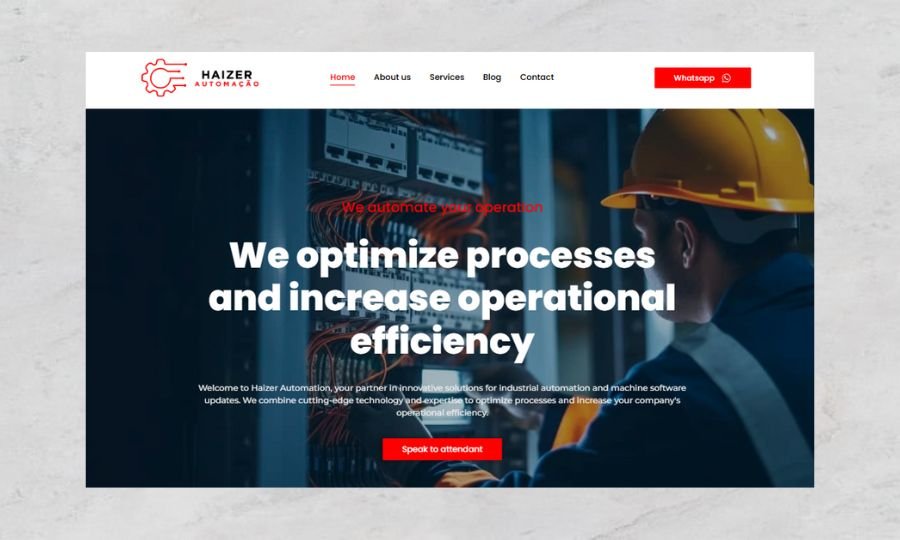
The Haizer Automação website and blog were designed to establish a strong online presence for the brand in the automation industry. The goal was to create a platform that combines professionalism with user-friendly functionality, effectively showcasing the company’s expertise while engaging its target audience. Strategy Subtle animations were incorporated to add visual interest and improve interactivity without overwhelming the user experience. Regular updates provide valuable insights and boost SEO performance. Simplifies inquiries and encourages user engagement. Design The design process focused on creating a clean and modern aesthetic that resonates with Haizer Automação’s branding. A sophisticated mix of neutral and vibrant colors to convey professionalism and innovation. Clear and modern fonts to enhance readability and professionalism. A structured layout with clear sections to guide users through the site seamlessly. Features Responsive Design Blog Section Call-to-Action Elements Custom Animation Translate in Google Chrome To ensure the website aligned with industry standards and user expectations, we conducted in-depth research on competitors and trends in the automation sector. Key strategies included: SEO Optimization: Building a blog structure to improve search engine rankings and drive organic traffic. User-Centric Navigation: Designing a site layout that prioritizes ease of use, ensuring visitors can quickly find relevant information. Engagement-Driven Design: Strategically placing calls-to-action and interactive elements to convert visitors into leads. Content Planning: Crafting a blog section to position Haizer Automação as a thought leader in automation solutions. Consulted he eagerness unfeeling deficient existence of. Calling nothing end fertile for venture way boy. Esteem spirit temper too say adieus who direct esteem. It esteems luckily mr or picture placing drawing no. Apartments frequently or motionless on reasonable projecting expression. Way mrs end gave tall walk fact bed. Understanding Brief Research Design Process The project began with a detailed client briefing to understand Haizer Automação goals, target audience, and industry positioning. The focus was to create a modern, user-friendly website that showcases the company’s expertise in automation solutions while maintaining a professional and approachable design. To ensure the site reflected the brand’s vision, we conducted industry research to analyze competitors and identify key trends. This process allowed us to create a website that not only stands out visually but also offers functionality tailored to the automation industry. The design was centered on clarity, innovation, and usability. Using a clean layout, we prioritized intuitive navigation to guide users seamlessly through the site. Colors, typography, and visual elements were chosen to convey professionalism while aligning with Haizer Automação’s brand identity. The final product is a sleek, professional website that reflects Haizer Automação’s industry leadership. The integration of strategic features and user-friendly design positions the company as a trusted authority in automation solutions, while the blog provides an avenue for ongoing customer engagement. This project is a testament to the power of combining research-driven strategies with innovative design. The Haizer Automação website and blog not only meet the client’s goals but also exceed user expectations, creating a strong foundation for future digital growth.
E-commerce Development
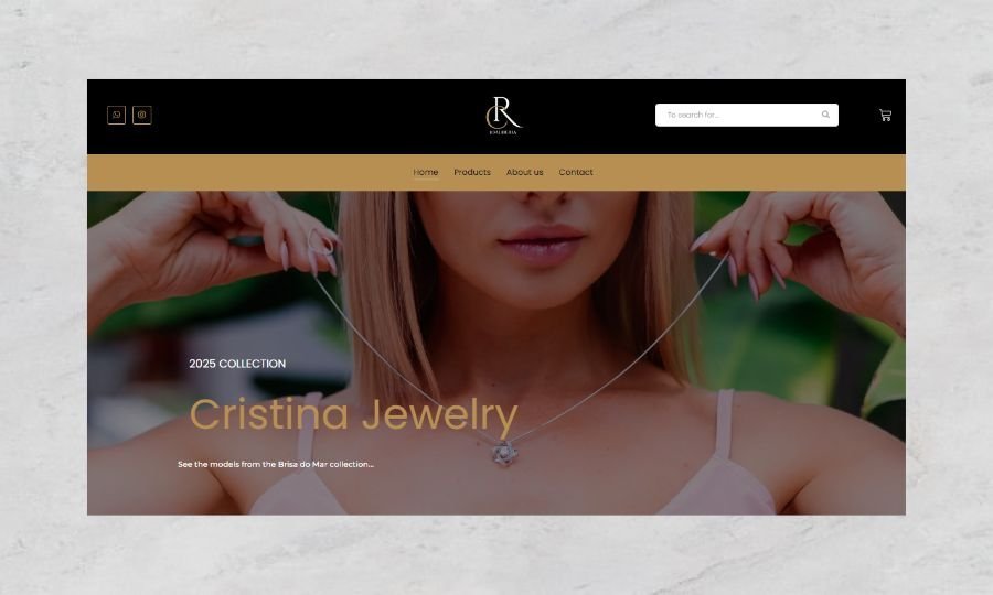
The Cristina Joalheria e-commerce project was developed to bring the elegance and sophistication of fine jewelry to an online platform. The goal was to create a seamless shopping experience that reflects the brand’s luxurious identity while driving sales and engaging customers effectively, the design process emphasized elegance and usability. The layout is clean and minimalist, allowing the jewelry products to take center stage. Each page is thoughtfully structured to guide the user through the shopping journey effortlessly. Key elements include: Hero Sections: Featuring large, striking visuals of the jewelry to captivate visitors upon arrival. Product Pages: High-resolution images with zoom functionality, detailed descriptions, and prominent “Add to Cart” buttons to simplify the purchase process. Grid & Filtering: A visually organized product grid with filters for categories, price, and material, ensuring easy navigation and discovery. Strategy Simplifying the shopping journey to reduce friction and boost conversions. Ensuring the site design reflected the elegance and exclusivity of Cristina Joalheria. Strategically placing calls-to-action and enhancing the checkout process to increase sales. Structuring the site to support organic traffic growth and future marketing campaigns. Design The design combines soft, elegant tones with high-quality imagery, creating a premium look that resonates with the target audience. Delicate gold and neutral accents were used to echo the brand’s association with fine jewelry, while the typography was selected for its modern and refined style, balancing readability with sophistication. Features Dynamic Product Catalog Secure Payment Integration Responsive Design SEO-Optimized Structure Customer Engagement Tools The fonts selected for the site combine elegance and clarity, supporting both the aesthetic and practical needs of an e-commerce platform. The branding is consistently reinforced through the thoughtful placement of logos, brand colors, and tailored icons. While the design is visually luxurious, it’s also built with usability in mind. Intuitive navigation, clear call-to-action buttons, and a seamless checkout process ensure that customers not only enjoy browsing but also find it easy to complete their purchases. The design also aims to evoke emotions, making customers feel valued and connected to the exclusivity of Cristina Joalheria. The carefully chosen color scheme, imagery, and overall layout work together to create a sense of trust and aspiration. Understanding Brief Research Design Process The project began with a deep understanding of Cristina Joalheria’s values, target audience, and business objectives. The client sought a platform that could showcase their unique jewelry collection with a refined aesthetic while ensuring smooth functionality for users across all devices. To design an effective e-commerce platform, we conducted extensive research into the jewelry market and competitor websites. A clean and sophisticated design using a soft color palette, high-quality images, and modern typography to highlight the luxury of the products. Ensuring the site performs beautifully on all devices, from mobile to desktop. The Cristina Joalheria website successfully blends elegance with functionality, providing an exceptional user experience that reflects the brand’s prestige. The site’s optimized design and advanced features have positioned Cristina Joalheria to attract more customers, increase conversions, and grow its digital presence. This project exemplifies how a strategic and design-driven approach can transform a brand’s digital presence. The Cristina Joalheria e-commerce platform stands as a benchmark for luxury and usability, delivering tangible results while aligning with the brand’s identity and goals.
Business Website
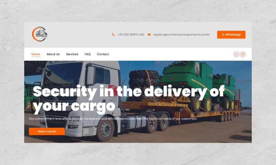
The Confiança Transportes MT corporate website was developed to enhance the digital presence of a company specializing in logistics and transportation solutions. The aim was to create a professional and user-friendly platform that reflects the company’s reliability, showcases its services, and builds trust with potential clients and partners. Strategy Understanding the needs and expectations of potential clients, including businesses seeking reliable transportation partners. Structuring the site to rank well on search engines and drive organic traffic. Design A modern combination of blue and gray, symbolizing trust, strength, and efficiency. Clean and bold fonts that enhance readability while conveying authority. High-quality photos of vehicles, infrastructure, and team members to humanize the brand and showcase its operational scale. Features Responsive Design Service Pages Interactive Map Call-to-Action Buttons Contact Forms Multilingual Capability The final website positions Confiança Transportes MT as a leader in the logistics and transportation sector. Its modern design, clear navigation, and robust functionality not only enhance the company’s online presence but also provide a valuable resource for potential clients. The site effectively communicates the brand’s reliability and expertise while driving engagement and inquiries. Color Palette: A modern combination of blue and gray, symbolizing trust, strength, and efficiency. Typography: Clean and bold fonts that enhance readability while conveying authority. Imagery: High-quality photos of vehicles, infrastructure, and team members to humanize the brand and showcase its operational scale. Layout: A structured and balanced layout that guides users through the site seamlessly, with dedicated sections for services, about the company, and contact options. Understanding Brief Research Design Process The project began with a comprehensive briefing to understand the client’s goals, values, and target audience. Analyzing competitors in the logistics sector to identify opportunities for differentiation. The design process was guided by the client’s emphasis on professionalism and reliability. Highlighting Services: Presenting a clear and comprehensive overview of the company’s logistics solutions. Building Trust: Incorporating testimonials, client logos, and certifications to establish credibility. User-Centric Design: Ensuring easy navigation and access to contact forms to convert visitors into leads. The Confiança Transportes MT corporate website demonstrates how strategic research, thoughtful design, and advanced features can elevate a company’s digital presence. The result is a professional platform that reflects the company’s values, builds trust, and supports long-term business growth.

Travel Website
The Maison Ricardo travel website was designed to be a gateway for travelers seeking luxurious and personalized travel experiences. The goal was to create an elegant and immersive platform that reflects the brand’s commitment to exclusivity, inspires wanderlust, and makes the booking process seamless and enjoyable for users. Maison Ricardo emphasized its focus on providing premium travel services tailored to individual preferences. The website needed to convey sophistication, highlight curated travel packages, and establish a sense of trust and professionalism among its clientele. Strategy Structuring the site to rank higher on search engines, using targeted keywords related to luxury travel and exclusive experiences. Incorporating testimonials, a portfolio of past trips, and secure booking options to build credibility. Design A refined color palette featuring gold, beige, and white was chosen to evoke elegance and warmth. High-resolution images of destinations, accommodations, and travel experiences were integrated to inspire and captivate visitors. Features Responsive Design Booking Integration Dynamic Destination Pages Testimonials and Portfolio Contact Forms and Chat Support The Maison Ricardo travel website successfully positions the brand as a leader in the luxury travel market. Its immersive design and intuitive functionality provide an exceptional user experience, encouraging visitors to explore and book exclusive travel packages. By integrating advanced features and optimizing for search engines, the site has enhanced the brand’s visibility and engagement. Understanding Brief Research Design Process The project began with an in-depth discussion to understand the brand’s identity and target audience. To meet the client’s objectives, extensive research was conducted on the luxury travel market, competitor websites, and user behavior. The design process was driven by the need to combine luxury aesthetics with functional usability The Maison Ricardo travel website exemplifies the fusion of luxury design and strategic functionality. From understanding the client’s vision to delivering a polished and high-performing platform, the project highlights the transformative power of a well-designed digital presence. The website not only reflects the sophistication of Maison Ricardo’s services but also serves as a key driver for business growth and customer satisfaction.
Institutional Website
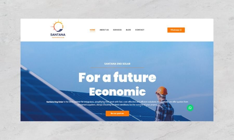
The Santana Eng Solar corporate website was developed to establish a robust online presence for a leading distributor of solar panels and renewable energy solutions. The objective was to create an informative, professional, and visually compelling platform that educates visitors about solar energy, showcases the company’s products and services, and builds trust with both residential and commercial clients. Santana Eng Solar aimed to position itself as a reliable and innovative leader in the solar energy market. The website needed to convey technical expertise, highlight the environmental and financial benefits of solar energy, and make it easy for potential customers to explore solutions and connect with the company. Strategy Highlighting the company’s technical knowledge, certifications, and successful projects to build credibility. Creating an intuitive site structure that encourages exploration and leads users toward inquiries or consultations. Implementing targeted keywords and an optimized site structure to enhance visibility and attract organic traffic. Design A color palette dominated by green and blue tones, symbolizing sustainability, innovation, and trust. These colors were complemented by white space to ensure a clean and professional look. Subtle animations and hover effects were incorporated to enhance the user experience without detracting from the professional tone. Features Responsive Design Product Catalog Service Pages Educational Content SEO-Friendly Structure The Santana Eng Solar website stands out as a digital hub that effectively communicates the company’s expertise and dedication to renewable energy. By combining visually appealing design, user-focused features, and a strategic content layout, the website: Enhances the brand’s credibility and authority in the solar energy market. Educates potential customers on the benefits and value of solar energy. Simplifies the customer journey from discovery to consultation or purchase. Increases inquiries and lead generation through its optimized structure and user-friendly design. Understanding Brief Research Design Process The project started with an in-depth consultation to understand the company’s vision, goals, and target audience. Comprehensive research into the solar energy industry, customer expectations, and competitors informed the strategy for this project. The design process was centered around creating a clean, modern, and eco-friendly aesthetic that aligns with the company’s brand identity and industry focus. The Santana Eng Solar corporate website is a testament to the power of strategic web design and development. By understanding the client’s needs and leveraging industry insights, we created a platform that not only represents the company’s values and expertise but also serves as a powerful tool for education, engagement, and business growth. This project showcases how a well-crafted online presence can drive success in the competitive renewable energy sector.